Sustainable Markets Initiative / 2021
Terra Carta
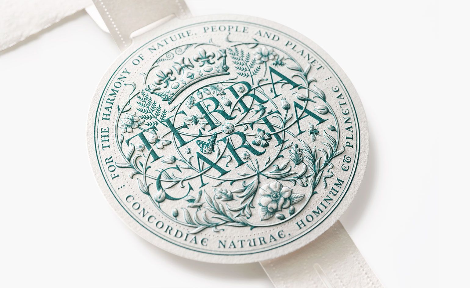
An intricate seal in which typography and the natural world become inseparable.
About the project
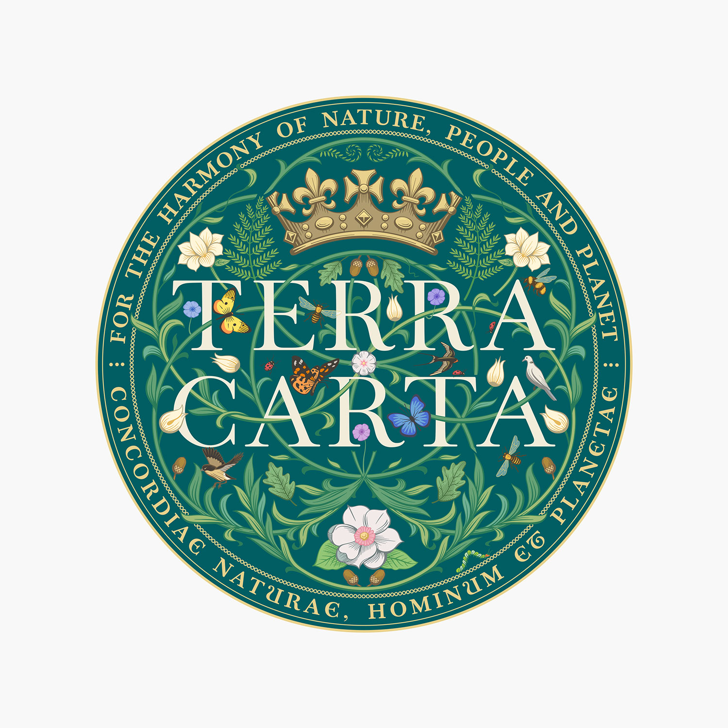
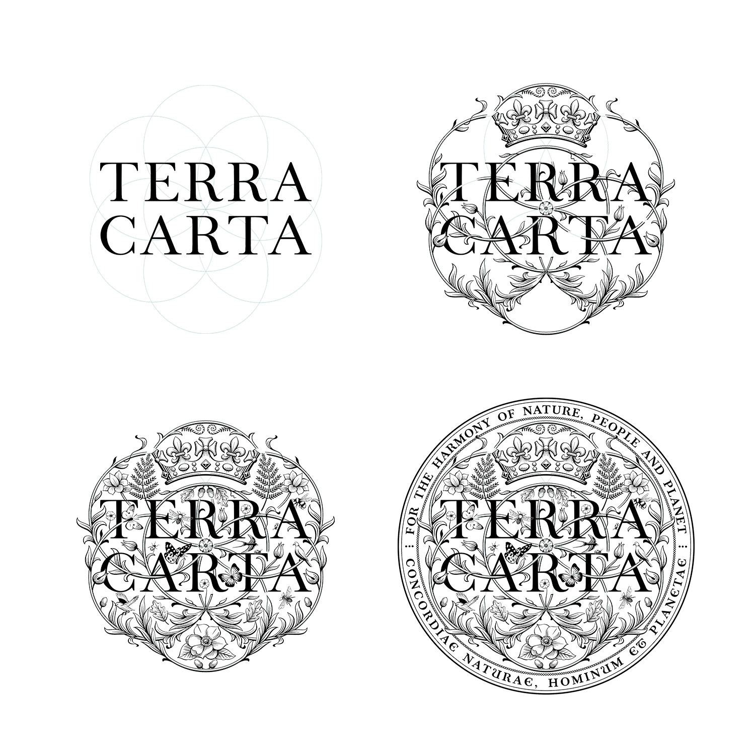
The Terra Carta Seal recognises companies working towards the Sustainable Markets Initiative’s environmental ambitions. LoveFrom’s design places a custom typographic composition inside a dense network of flora and fauna.
Oak leaves, ferns, magnolia and wildlife are woven around the words, with the circular composition giving the identity the authority of an institutional seal. It appears both as a detailed graphic and as a physical embossed object.
The project was among LoveFrom’s first publicly visible commissions. It also introduced a wider audience to LoveFrom Serif, establishing a connection between the studio’s patient typographic research and its commissioned graphic work.
Sources & credits
Images: LoveFrom / Sustainable Markets Initiative press imagery, via Wallpaper*.
An independent research record. Images remain the property of their respective rights holders.
Explore the wider story: Jony Ive’s projects after Apple →
Next in the archiveLoveFrom, Serif